Read more ...
San Francisco - Walking Tour
Thursday, July 25, 2013
So not much of a lie in; we woke up, around 7 AM, ready to start the day. Despite the early wake-up we didn’t leave the hotel until 9.30 AM. We decided today that we would do a walking tour of San Francisco, to check out some of the main sites. We started by heading over to Union Square. It’s about a mile from the hotel, so it took about 20 minutes. We both wore jeans today as it was pretty cool out and I was wearing a jumper, and Dani, a coat. At Union Square, we headed into Macy’s department store to get some breakfast from the in-store Starbucks. I had a cup of tea and a chocolatine and Dani had a cinnamon roll with a vanilla latte. It was $11, which we thought was okay. After breakfast, we had a look at the cheesecake factory on the top floor (Rhi had told us about this). We didn’t have any cheesecake, but we had a look out from the balcony over Union Square and took some pictures. We didn’t spend much time looking in the shops, but we did see a flat pop-out tram (the pieces pop out and slot together to make 3-D model). We didn’t get it but thought it might make a good present for someone.
We headed out from Macy’s to start our walking tour. First, it took us through Chinatown. It was really colourful; there were people playing traditional Chinese music and at one point, a van pulled up full of watermelons, which was quickly surrounded by lots of people. Next, we headed up to Lombard Street (the most crooked street in San Francisco). I think it’s because the incline is much too steep to be straight, so it wiggles all over the place. It looked really colourful, with big hydrangea plants planted all the way up. There were lots of people taking photos - including the people in the cars, driving down! There was also an amazingly vivid pink bougainvillea growing up a striking blue house, which was stunning.
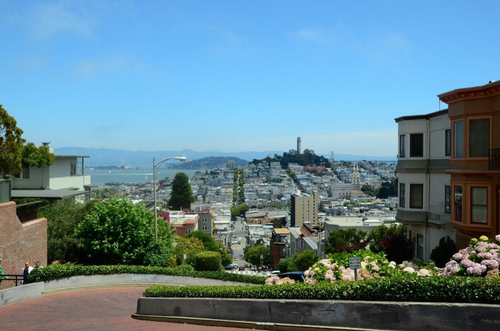
We trekked up the 250 odd steps and admired the views for a while. From there, we headed to Fisherman’s Wharf. We had a wander among the historic ships and then went to Pompeii’s Grotto for lunch. I had a clam chowder in a sourdough bowl and Ben had a BLT with fries - with a local beer each, called Anchor Steam. It was really nice - about $35. It was starting to get sunnier as we had lunch and the mist seemed to have cleared.
We carried on walking along the wharf, stopping off at Pier 39 to look at the local sea lion populace. We then headed up to Goit Tower, up a great many steps - we had to ask two different people how to find our way up, as it wasn’t marked. So, exhausted and hot, we admired the views when we got to the top, although it took us a while to recover from the climb! We decided not to go up in the tower itself - the queues were epic and the observation level seem to be enclosed in glass, so we weren’t bothered. Wandering around the outside, we saw a hummingbird - quite exciting!
From there, we headed back towards Union Square. We were going to get an ice-cream on the way, but didn’t see anywhere. We were getting very weary and were keen to find somewhere to sit! On the way up to Starbucks in Macy’s, we had a look at the pop-out tram, but it was $14 which seemed quite expensive (it’s by some designer). Once in Starbucks, we discovered it was packed - no seats and people standing. We tried a couple more Starbucks that were nearby(they are quite literally on every corner!) before settling in an Irish pub. We had a couple of drinks, which were surprisingly expensive ($7 for a pint!)
We had a look in our tourist booklet for places to eat, and settled on Lori’s Diner, which was nearby. It looked like a proper American diner, complete with a cut out car on the front! We sat at the counter next to some other Brits. You could see the food being cooked as we waited. Dani had a Lori ‘signature’ burger and I had a Big Bopper (bacon cheeseburger). We also had onion rings to share, and a couple of cokes. As it turned out, the portions were massive! I finished my burger, but Dani didn’t, and there were lots of onion rings left. It cost $40 with a $5 tip. From there, we headed back to the hotel, feeling shattered. We watched a bit of TV and looked at some photos before nodding off. Alcatraz tomorrow!
and we're back!
Thursday, July 15, 2010
after a long, long . . . . long time, we're finally back online!
continue reading Last day in Rome
Wednesday, July 29, 2015
We had a slightly later start today, only just making it down for breakfast. We decided to catch the B line train over to the Vittorio Emanuele monument, stopping at Colesseo and walking the rest of the way. The monument is very grand is home to a couple of museums and the tomb of the unknown soldier. You can climb up part of the way for free, and able to admire the views of the surrounding landscape including colesseo which can't be seen from the other viewpoints we've visited (castle St Angelo, St Peter's basilica). You can also get the elevator to the very top for 7 Euros, so we did.
The view from the top was fantastic! You could see a lot further at the top. It was very hot in the sun but there was some shade cast at either end of the viewing platform and a welcome breeze, so we sat and cooled down for a while. One of the sights we saw was one that looked a little like the colesseum - half a circle in diameter and made up of large archways. According to the map, it was the Teatro Marcello and was surrounded by a number of ancient columns, so we decided to make that our next stop. We made our way towards it, stopping to take some pictures and for some gelato en route.
The way to the Teatro building took us along some of the backstreets of Rome, winding in amongst the houses. When we got there, we wandered round. Some of the structure appears to have been replaced which highlights how worn the older stone is. It was very impressive surrounded by some complete and some broken columns and bits of ruin.
From there, we wandered towards and across the river, passing through isola (the island) on the way. There appeared to be various events set up - open air cinema, stages and restaurants - all along that stretch of river. Could be nice if you were about in the evening. We pottered about, stopping in a bar for a drink and a sit, before visiting the nearby church, Santa Maria, which has some beautiful mosaic work behind the alter. From there, we headed back to the hotel for a rest before dinner, catching the metro B line from circo massimo. Encountered our first !ertro derlays, however, and had to wait 45 minutes before there was a train we could squeeze into. Technical problems, apparently!
Had a rest at the hotel before heading out for tea. Returned to Meid in Nepols once more, as we enjoyed it before and it's so close. Again, enjoyed it, both of us having pasta this time and we returned to the hotel feeling very full and weary!