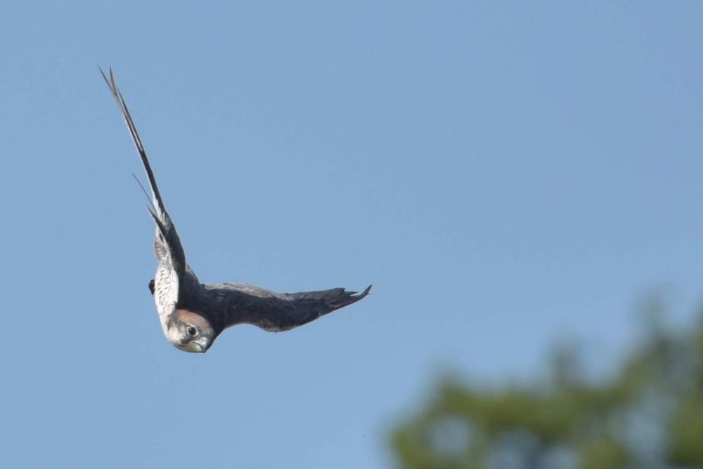
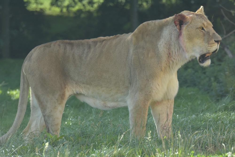
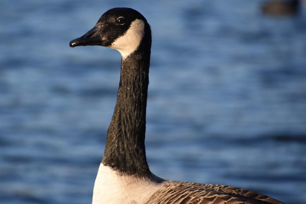
Happy birthday, Dad!
Monday, June 27, 2016
The weather has finally picked up a bit - just in time to wish you a very happy birthday!
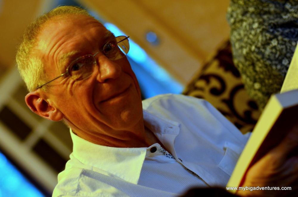
See More: #birthday |
 | Posted by Danica Scott at 17:26 |
| comments 1 |
The weather has finally picked up a bit - just in time to wish you a very happy birthday!
See More: #birthday |
| Posted by Danica Scott at 17:26 |
| comments 1 |
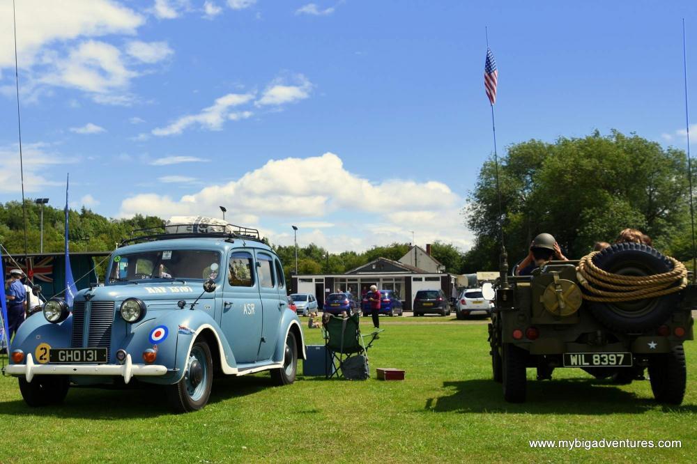
I'm up in Sheffield for mums birthday weekend and today we headed over to Shireoaks for their armed forces day fair. There were some army trucks and fighter jet cockpits to look at in addition to a drumming band and army assault course. The weather has been great, very sunny and warm with just a bit of a breeze. It's also the Steam Fair weekend so might try and see that tomorrow. I've added a few photos to the album linked below.
So a couple of years ago we went on a big summer holiday to America. Having been teachers for a while we thought it was about time we made good use of the holiday before they eventually take it off us, and so we headed off to America for 4 and a half weeks. Unfortunately the website was not up and running at that time, and so we weren't able to document the trip on here. Now that everything is running fairly smoothly and to celebrate a brand new shiny gallery, I've added some more photos. There's quite a few, organised into the different cities that we visited during the trip to please have a browse. Sign up, leave some comments and let us know what you think.

For those interested in the new gallery - its powered using the FanscyBox 2 JQuery library. It was pretty straight forward to add in, although there was a fair bit of head scratching involved to get the photo comments back up alongside images. I'm pretty happy with the results though. Enjoy the photos
. . . sadly folks the end of the trip is fast approaching, much faster than we had infact anticipated and now we find ourselves with just Paris to go. This is only a short one as we still have packing and showers left to go and checkout is in an hour . . . oh we're in Bruges (Belgium) by the way - I'm sure you'd all like it here - its very nice. We have now uploaded the rest of our photos including Strasbourg, Amsterdam and here. Hope the sun is as shiny there as it is here. Catch you all very soon, xx